Exhibition catalogs, books, and other publications
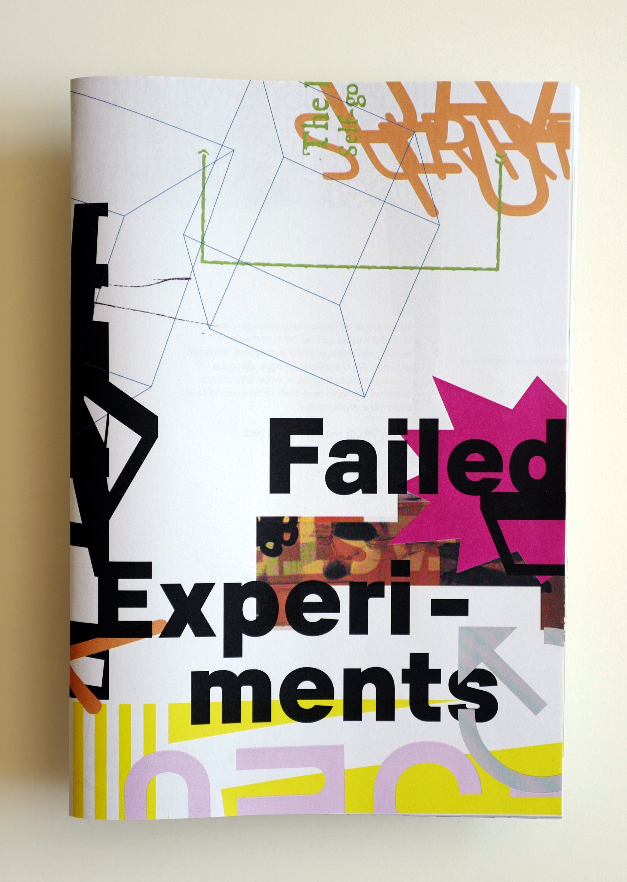


Failed Experiments
Can design be recycled? This work is a collection of failed design explorations, where tidbits of text and images that were pushed off to the side of layouts, just residing on the outskirts of the pasteboard, have been forgotten until the creation of this book. Some are shown simply as they were, untouched, while others have elements that have been recombined to form alternate compositions. More…
Recognition:
Graphic Design USA | American Graphic Design Award
Indigo Design Awards | Bronze
NYX Awards | Silver


Outlying
Post-exhibition publication and design
The Outlying exhibition is our solo show that represents investigation in two areas: outlying design form and outlying design content. Outside of common design practice and common design mediums, the works developed for Outlying stem from personal interests in and notions of identity and popular culture, whimsy and improvisation, as well as experimental work with language and typography. Examining form, the works lean outward from standard graphic design practice to areas that are uncommon or blend with other disciplines. Examining content, the works focus on design itself as subject matter. Outlying was organized by Jean Carey at Seerveld Gallery, in the greater Chicago area.
Recognition:
Muse Creative Gold Award
NYX Silver Award
American Graphic Design Award and published in Graphic Design USA
Creative Quarterly Runner-up
Graphis Award and published in Graphis Design Annual


Crossover
Outlying Exhibition | Seerveld Gallery, Palos Heights, IL | Publication and design
Crossover showcases the images of a cross-disciplinary practitioner (the photography of a designer) and explores the restraints of an automated printing process and the series of serendipities it can yield. Additionally, the definition of crossover, as transcending borders, is an underlying reference to Outlying’s topic of pushing past boundaries as well as an attribution to our immigrant origins.
The images in Crossover can be viewed in three ways: one half of each image on separate spreads and then as whole images when page folios are spread apart and reveal that each image crosses over the gutter area of the page layout. In the spirit of the Surrealist exquisite corpse game, the spreads yield unexpected combinations of image pairs.
I See Pixels
Exhibition catalog design
This catalog for an exhibition, curated by media artist Niki Nolin, represents digital works that were inspired by her teaching practice. The design explores a balance between crisp pixelation (retro elements) and photographic softness to yield a contemporary notion of digital content.
Recognition:
CQ Excellence Award and published in Creative Quarterly Journal 57
American Graphic Design Award and published in Graphic Design USA
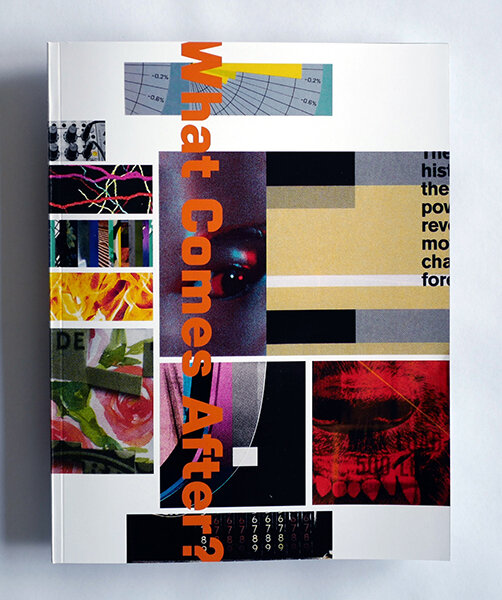

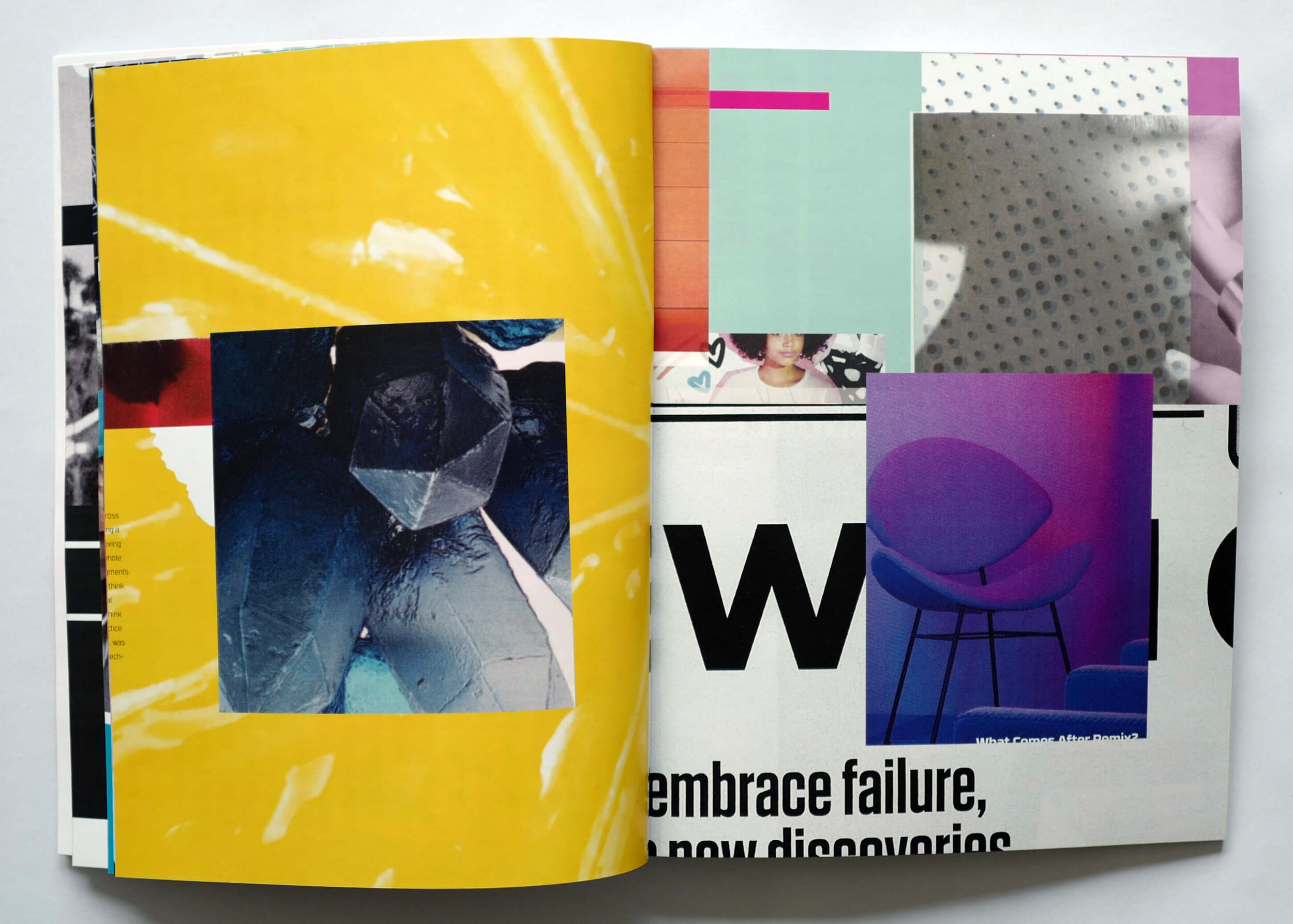


What Comes After
Exhibition publication and design
What Comes After is an exhibition created to serve as a manifestation of What Comes After Remix?, an essay by new media theorist Lev Manovich. Exhibition walls and surfaces are covered in a dense layering of images composed by randomly selected found images — a remixing of found images collected from various sources. The 72-page publication takes a similar approach with mixes upon mixes of imagery in densely layered compositions that reflect upon contemporary media culture and the act of appropriation.
Recognition:
CQ Excellence Award and published in Creative Quarterly Journal 57
American Graphic Design Award and published in Graphic Design USA


Dada Surrealism Futurism
Exhibition catalog design
This catalog for an exhibition curated by Debra Parr expresses the readymade and collage aspects of Dadaism through images derived from overlapping and torn street posters. Simultaneously, the image of the eye aims to evoke the bizarre and Surrealism as a nod towards Luis Buñuel and Salvador Dalí’s Un Chien Andalou. Embracing Futurist concepts of revealing process and movement, the publication typeface utilizes and reveals type design technology, specifically smart OpenType substitutions.
Recognition:
Graphis Award and published in Graphis Design Annual
STA 100 selection
CQ Excellence Award and published in Creative Quarterly Journal 53
HOW International Design
Creativity International Silver Award
Typotheque Gallery

Database Narrative
Exhibition concept, exhibit design and catalog
Recognition:
CQ Excellence Award and published in Creative Quarterly Journal 53
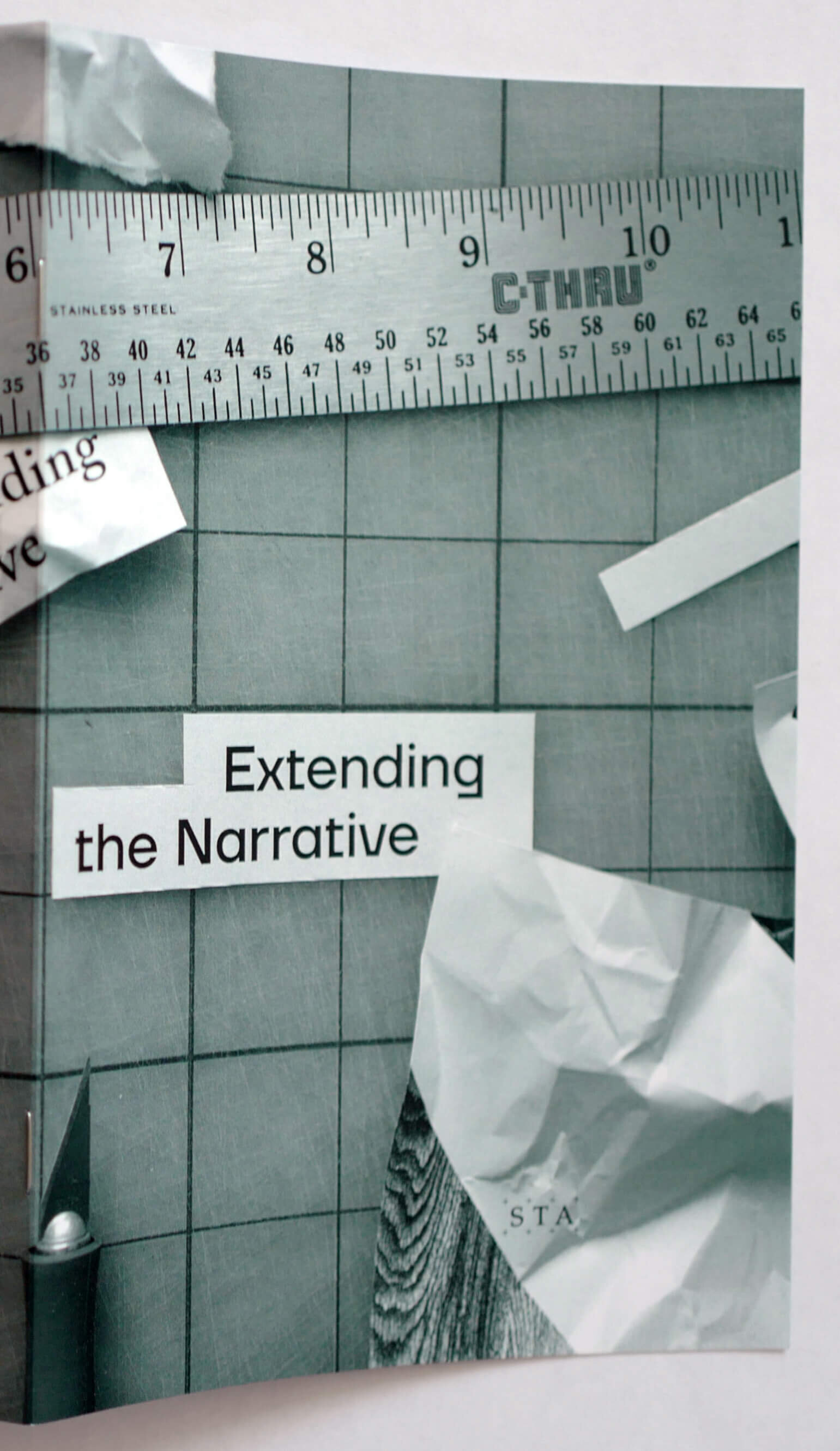


Extending the Narrative | Next | Planned Unpredictability | Dearly Discarded
STA Design Inspiration Weekend, The Society of Typographic Arts | Programming themes and event identity
The Society of Typographic Arts (STA) was established in 1927 by Chicago’s leading professional designers, typographers, and printers to encourage excellence in the printing and publishing industries. The STA Design Inspiration Weekend is a design forum held in the greater Chicago area. Guy and Sharon generate the annual event theme and description, and design the visual identity.
Recognition (Planned Unpredictability):
American Graphic Design Award and published in Graphic Design USA


90 Years of The Society of Typographic Arts
Anniversary documentation | Edited and designed in collaboration with Wayne Stuetzer
In an event that took place in the 1920s, designers affiliated with the Chicago Chapter of AIGA held an unsanctioned, notoriously wild party on Lake Michigan. When the AIGA Board of Directors in New York learned of the incident, they disavowed the Chicago Chapter on the grounds of lack of control over members. The orphaned designers then gathered to form The Society of Typographic Arts (STA). The salacious start of this professional design organization foreshadowed events to come in their 90-year history, including a temporary switch to the name of American Center for Design as well as an infamous dumpster-diving incident to save archival work. These incidents and others were uncovered in research for the commemorative book marking the 90th anniversary of the STA, Chicago’s oldest professional design organization. This limited edition book features more than 75 works of graphic design selected to establish a characterization of the era they represent. Published by the Chicago Design Archive.
Recognition:
American Graphic Design Award and published in Graphic Design USA
Conference presentations:
2019 | Type Tales Chicago | Held by Type Magazine | Chicago, IL | Chicago Design Through The Decades
2018 | Design Incubation 5.1 | Chicago Design Week | DePaul University, Chicago, IL | 90 Years of The STA
2018 | STA Design Inspiration Weekend | Itasca, IL | 90 Years of The Society of Typographic Arts
2017 | ATypI | Montreal, Canada | 90 Years of The Society of Typographic Arts


A+ | Xx | Counter!
TypeCon Education Forum | Programming themes and design
TypeCon is the leading annual international conference on typography. In conjunction with TypeCon, the Education Forum is a day of special programming designed to provide inspiration and information while examining important issues facing design educators and the institutions they represent. Individual and collective concerns are addressed as part of an inquiry into the current status of typographic instruction. As Chair of the TypeCon Education Forum Committee, Sharon initiated the Forum’s publication, and she and Guy design the issues in response to each year’s conference theme.

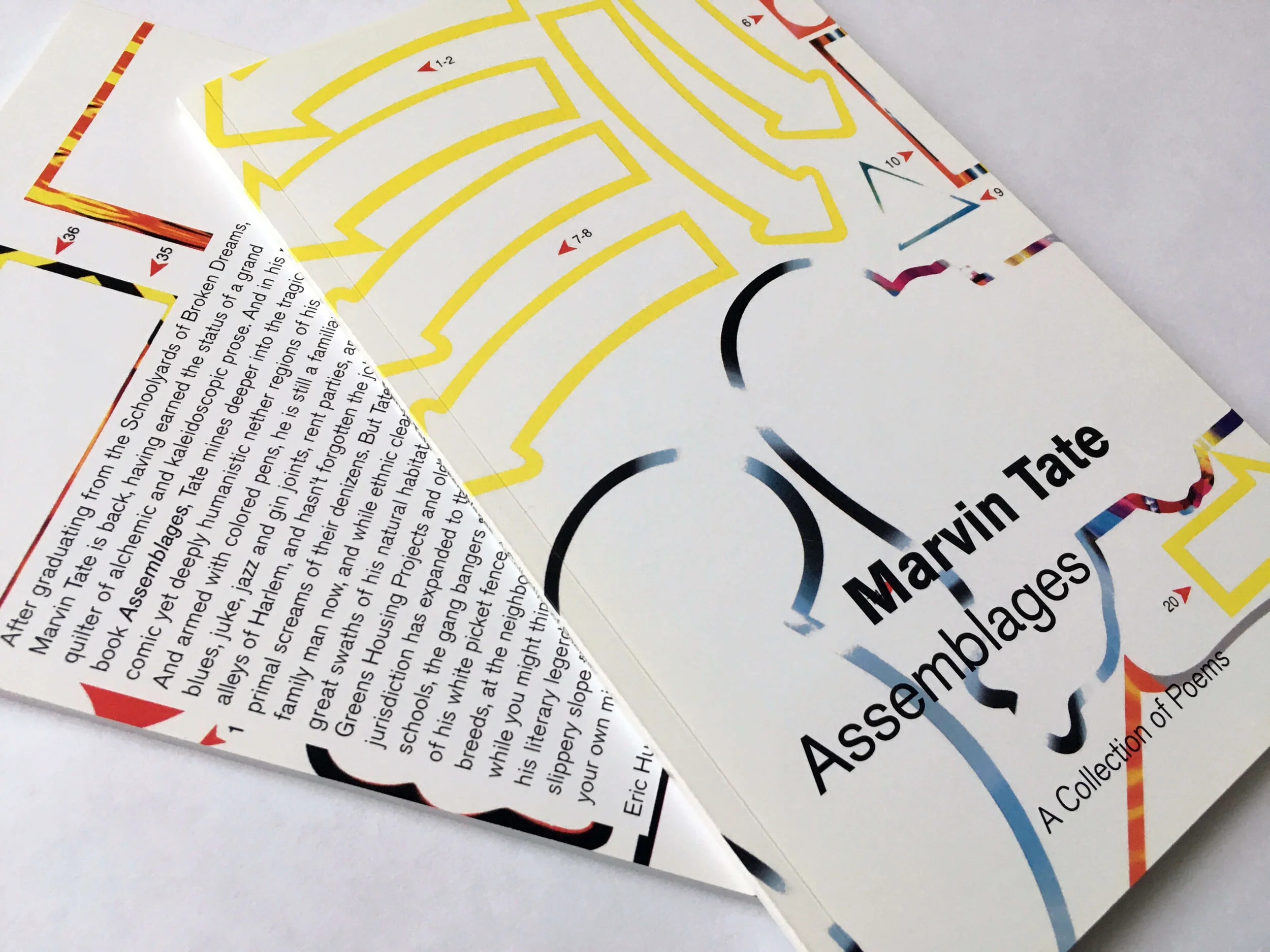
Assemblages
Chapbook
In collaboration with Chicago poet and performance artist Marvin Tate, Assemblages presents 50+ pages of Tate’s works of spoken word poetry. As a multidisciplinary artist and educator, Tate has been active in the Chicago music scene since 1993 and has collaborated with Leroy Bach, Theaster Gates Jr, the Black Monks of Mississippi, and jazz artists such as Ben LaMar Gay and Angel Bat Dawid. In broadcast media, he has been heard on NPR, This American Life, and HBO DefJam Poetry.
Recognition:
American Graphic Design Award and published in Graphic Design USA
Creativity International Award