Chicago Stars
54 x 36 inch flag | Exhibited at Field Day Festival, Navy Pier, Chicago, and at Flag Fest, Taste of Chicago | Held by Design Museum of Chicago in partnership with Terra Foundation for American Art
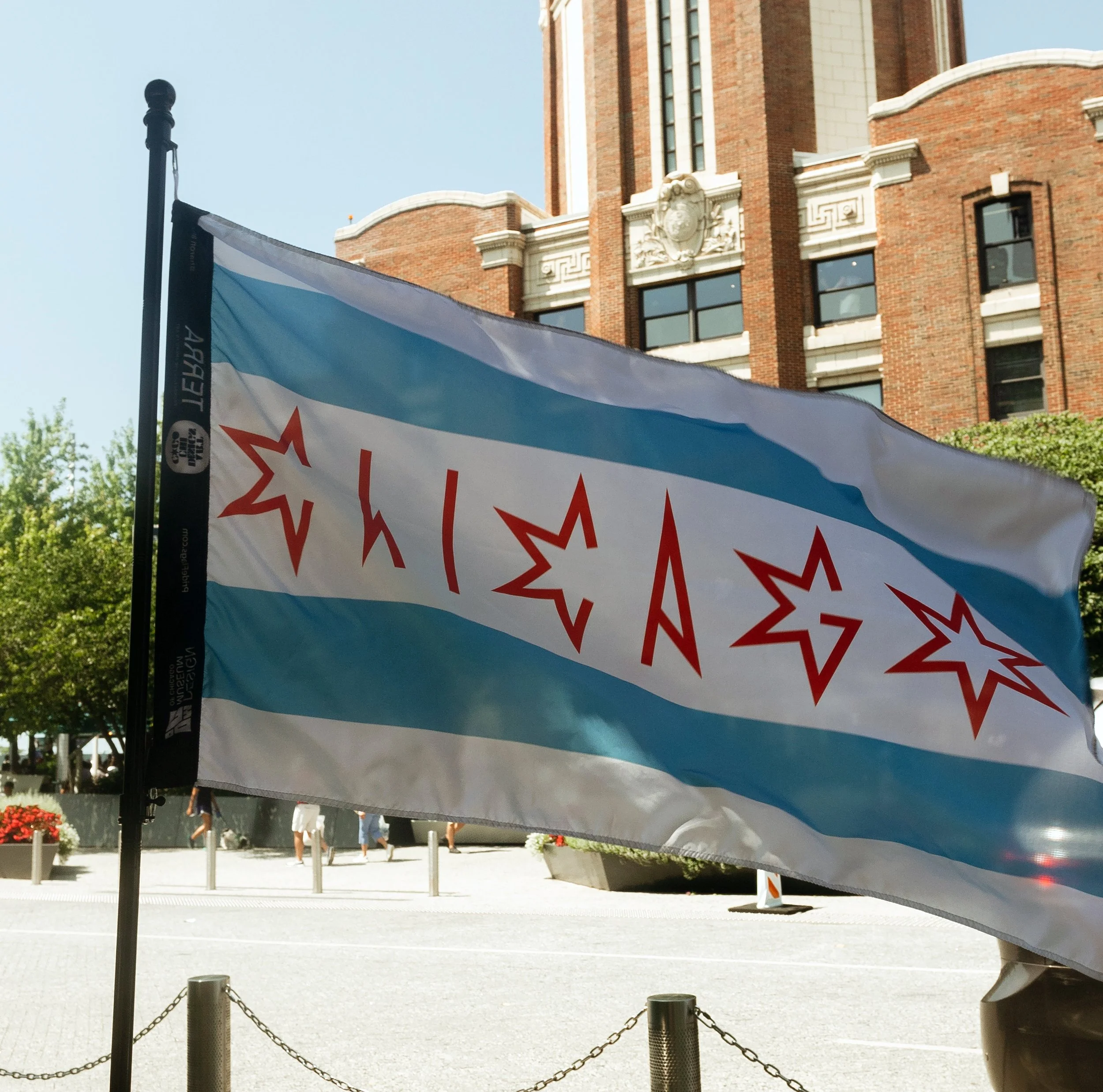
As an amalgam of two loves (the city and the practice of experimental typography), the concept of the flag design is driven by the Chicago flag itself, however, in place of stars, star-shaped letterforms display the word Chicago. The idea is a play on semiotics, as it utilizes a highly recognizable form but provides a twist. Familiarity supplies the entry point of engagement and, at the second that a difference is detected, it is anticipated that the realization that the stars are actually letterforms creates a gratifying aha moment.